Wednesday, September 22, 2004


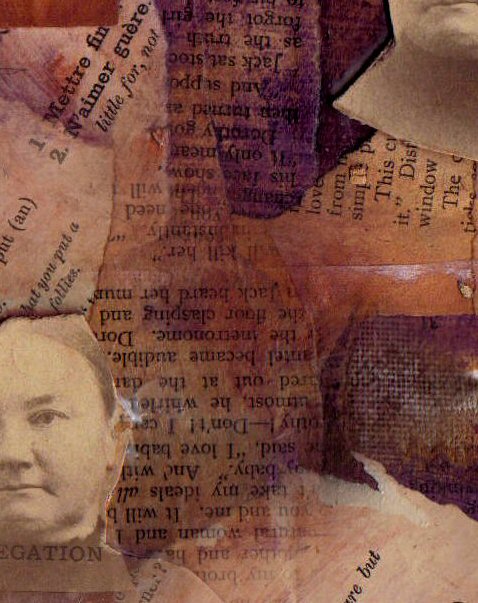
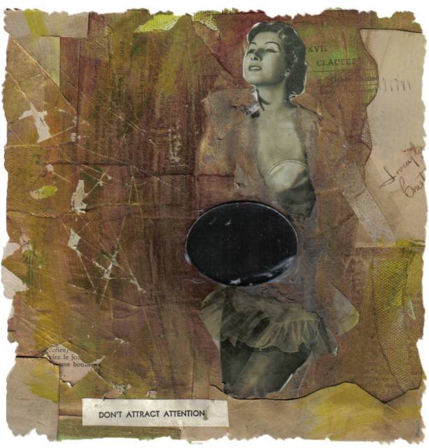
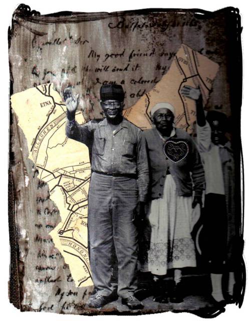
So here's another version of "Negation." Here, the emphasis, to me, seems on lessons, rules, the negatives of those things. Aslightly different view, although no less somber. In the original collage, I was trying to play around with having different book pages in different colors, with different typefaces. I've seen some collages that are only that--pages torn carefully from books and arranged so that the print is art. These are clearly people who are WAY into typography, although I have to admit to a certain attraction to it myself. I'm nowhere near being that pure of form.  Posted by Hello

I'm putting up two, similar collages--this one and a digital variation. Actually, both of these are digital variations on the original. Here, I cropped a portion of the original, after I'd done some tiling with it in my Paint program. This woman seems so somber, although here, I'm somehow seeing her as a reformer or early suffragette. Of course, more likely that she was just someone's mother. I found her picture in a box at my favorite South Street bookstore. They had a ton of these thick cardboard prints from the 1870s and into the early 20th century. I found the word, "Negation" in one of the old french lesson books I brought there. Posted by Hello

Monday, September 20, 2004


And still another variation . . .  Posted by Hello

A variation on a theme--I was playing around with my Paint program and ended up with this, which I think is really cool.  Posted by Hello

The other night I had a dream that I was trying to find the house of the man who sexually abused me for years. I wandered around a neighborhood--no one knew where he lived. Finally I found a doorway and I went inside. There was an elevator and there were stairs, both going down. There was a sign on the elevator that said, "The stairs are safer." So I took them.  Posted by Hello

Yesterday, Darvin and I went to a bookstore on South Street. While I flipped through their fabulous collection of post cards and letters, bought at estate sales on the Main Line, Darvin chatted with the owner. I was amazed to find all of these pieces of people's lives filed away in this one big box. It was strange to be holding these long-ago events in my hands, sorting through thank you notes from Uncle Billy and "Wish You Were Here" post cards sent from Niagra Falls. This one was sent in 1909, 15 years before my grandparents were born. As I was standing there, I kept imagining what it would be like to have someone sorting through my cards and letters almost 100 years from now. What would they do with them? Would they wonder who I was, the way I'm wondering about Miss Edith Baley, keeper of half the letters and cards I found in that box yesterday. Posted by Hello

Another "accident." I had glued down the woman and then decided I didn't like her, so I tore her off. You could still see the outline of her body, so I painted it with a wash of gold paint. Then I found the title, "Don't Attract Attention" in an old Emily Post etiquette book. It seemed perfect for this shadow of a woman. But it needed something else, so I pulled out some of the pieces I'd torn off and glued them back on. I'm feeling kind of negative about men lately (Darvin excluded), so I added the mirror to symbolize my sense that men want to see themselves in a beautiful woman--having pieces of her is enough as long as they can look good in her. Yes, cynical, I know .
 Posted by Hello

Sunday, September 19, 2004


I had a version of this on-line, but I didn't like it. It kept bothering me. I had a reclining woman at the bottom of the collage that, to my mind, has ended up jarring with what I mean to convey. So this is a different version, one I like better, although I'm not completely sure why that is.  Posted by Hello

Tuesday, September 14, 2004


More playing with digital images. I find the girls' eyes to be the most interesting, so I wanted to repeat that pattern. This also gives me a way to play around with what I could do in the physical collage. If I like the look of this, I can create several more images of the girl's face, print them out and glue them down. I'm finding that for some of these, I very much prefer the digital images.  Posted by Hello

Monday, September 13, 2004


I'm not sure what I'm enjoying more--physically producing collages or manipulating them digitally to create a variation on the original work. Although I like the original piece, I'm getting something extra--new textures and subtleties that I can't seem to produce when I'm working with the "real thing." I'm really digging the colors here, the two different shades of blue with the silver, layered over old maps that have a blueish green tint. I also scratched the surface of the collage to give it some additional visual interest and depth. The girl in the lower left hand corner is very mysterious to me in a way--she captures a feeling I had often as a child where she's part of the picture but not really of it. There's a sense of disembodiment that I remember well.  Posted by Hello

Monday, September 06, 2004


A Question of Principle
I love this one. If you look closely at the cut-out shape of the woman's face, you can see that it's actually a couple, standing together. I was scanning the couple when I saw the woman's face on the reverse side. I loved how strong she looks and I liked being able to capture two aspects of the tragedy of slavery--what happened to individuals as well as what happened to families. The bottom half of the background is actually an ad for a slave sale. I underlined the words "keep them free." Below that is diagram of how to pack a slave ship. The solid maroon color indicates the recommendation that people be so tightly packed together, you couldn't even see individuals.  Posted by Hello

This collage is pieced together from DaVinci's art. Across the neck of the woman is a transparency. I'd scanned in some drawings of ghostly men and women and printed them onto the transparency paper. Unfortunately, when I then did the crackled paint treatment, in wiping the collage down, much of what had been on the transparency went with it. If you look closely, you can still see the faint image of a man on the woman's chest, just above her bodice. Darvin says he likes this because it's "ghostly." I agree. I like the ethereal looking face over the more solid body. Somehow it communicates something to me about how our minds can separate us from the physical. Posted by Hello

Friday, September 03, 2004


"Perfect" couples cause a peculiar surge of aggression in me. For many years they had the capacity to intimidate me in ways I shudder to remember. I particularly abhor the kind of perfection intimated by the pictures of the two couples in this collage. They seem to have their shit together in ways I can only imagine. Of course, I know that perfection is boring and two-dimensional--it's our imperfections that make us at least interesting--and so the nature of my aggression toward it has changed. Rather than wanting to beat them for being perfect, I want to beat them OUT of their perfection, not for my sake, but for their own. Perfection is a weight that none of us should have to bear. And frankly, it gives the rest of us a bad name.  Posted by Hello

Yesterday I went to Pearl Art Supply on South Street and bought several more packets of canvases. I had a variety of sizes from which to choose, ranging from little 2x3 canvases to some so huge I didn't even want to imagine filling the spaces. I ended up getting several 6x8 and 8x10 and one pack of 10x14. I realized that I'm probably more at home in making smaller, more intimate statements than I am trying to get across some grand, larger message. I'm not even sure I have any great messages to share at this point. This collage is quiet with more subdued colors. I got a jpg of a letter off the web as the background and then used bronze and black paint. I like how the bronze seeped under the edges of the letter (I'd printed it on transparency paper--happy accident) and the addition of the heart to the old woman's chest. The map is of Pittsburgh, where Darvin is from, which seemed fitting. Posted by Hello

Thursday, September 02, 2004


The picture of the boy reminded me of Darvin. Faintly, in the upper left hand corner you can see a drawing of a woman, looking down on him. I wanted this to represent the feminine energy that exists in his life. I added the lizard to show his prickly side, as well as the prickly aspects of his life.  Posted by Hello